5.1 Running the Built-in Efficiency Testplan
The built-in efficiency testplan runs a series of steady-state simulations with different line and load conditions. After all simulations have completed, a final test named Generate Efficiency Curves creates three efficiency vs. load curves: one for each input voltage—nominal, minimum, and maximum. The Generate Efficiency Curves test does not execute a simulation; instead, this test collects data from all previous tests and plots the efficiency curves for the converter.
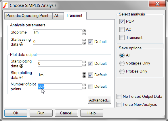
The nominal, minimum, and maximum input voltage values are taken directly from the DVM control symbol. The number of plot points defaults to 5k; however, to run the efficiency testplan, you need to increase the number of plot points.
To change the number of plot points before you run the efficiency testplan, follow these steps:
- From the menu bar, select .
- Click on the Transient tab.
- In the Number of plot points entry, change the value to 50k as shown
below:
To run the entire efficiency testplan, follow these steps:
- From the menu bar, select . Result: A pop-up hint provides information about the numerical calculation methods used to calculate the efficiency.
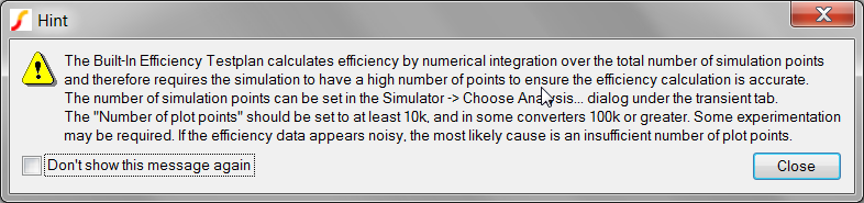
- Click Close to dismiss the hint window. Result: The test selection dialog appears:
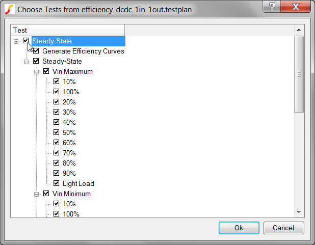
- To run all tests in the testplan, check the first Steady-State checkbox.
- Click Ok. Result: DVM runs the entire efficiency testplan for all three input voltages and for load currents from Light Load to 100%; then an overview test report opens with a summary of the results.
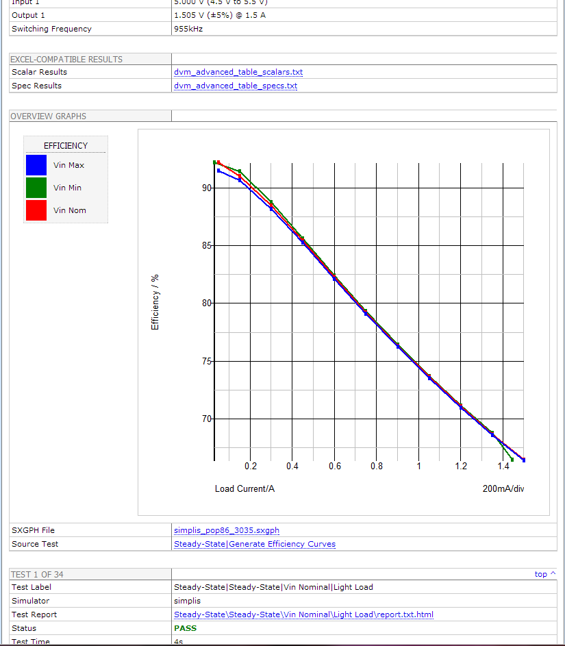
This report differs from the sync-buck report in the following ways:
- First of all, this overview report includes a graph created by the Generate Efficiency Curves test and placed on the overview report with the PromoteGraph() function, as explained in 6.4.2 Promoting Graphs to the Overview Report.
- Secondly, the efficiency curves differ from those in the sync-buck report since these curves are formed from data aggregated from each of the previous tests in this testplan. Each point on the efficiency curve represents the efficiency measured during an individual POP simulation run. The actual curves were generated with the CreateXYScalarPlot() function, which is explained in 6.6.2 Using the CreateXYScalarPlot() Function.